Every year, a new iPhone is revealed and inevitably met with the same first criticism: the unsightly notch is still there. Android phones, for their part, still have punch-holes in their displays. But now that I’ve had time with the ZTE Axon 30, a phone with an under-display camera and a clean display, I can confidently say: all that notch hate is pretty overblown.
It’s certainly better to have a display without a notch or punch-hole – it’s aesthetically pleasing to have a screen unmarked by a camera-containing hole or strip. It’s easy math: more screen area means more screen to watch movies and play games.
But you’re actually not missing much by missing out on the full-screen experience, not enough to really envy anyone. Why? Because that chunk of screen is pretty much dead real estate anyway.
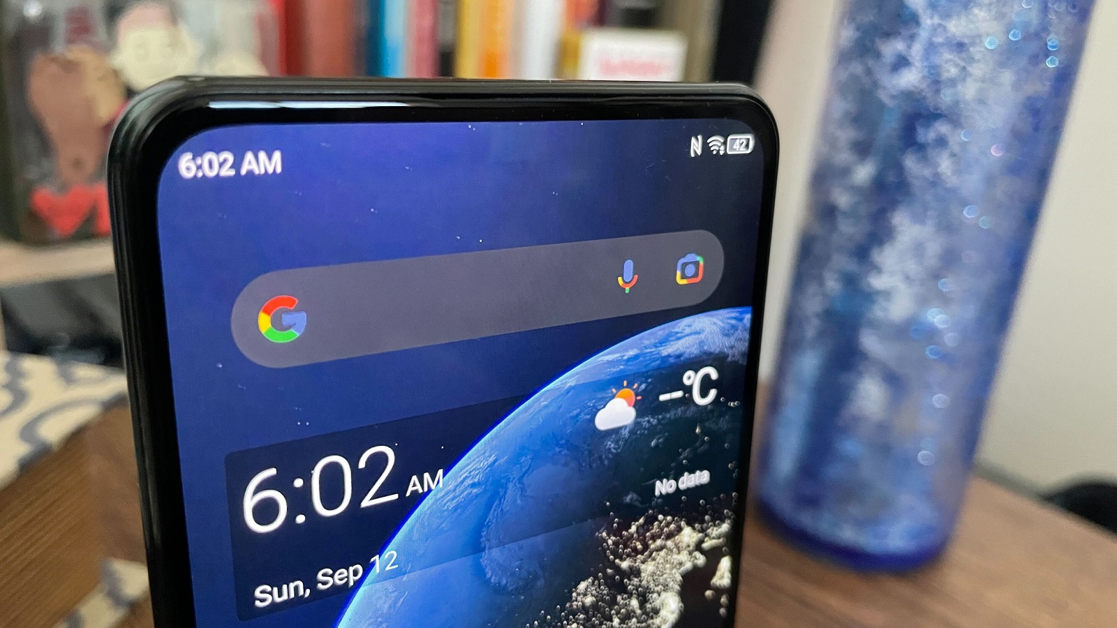
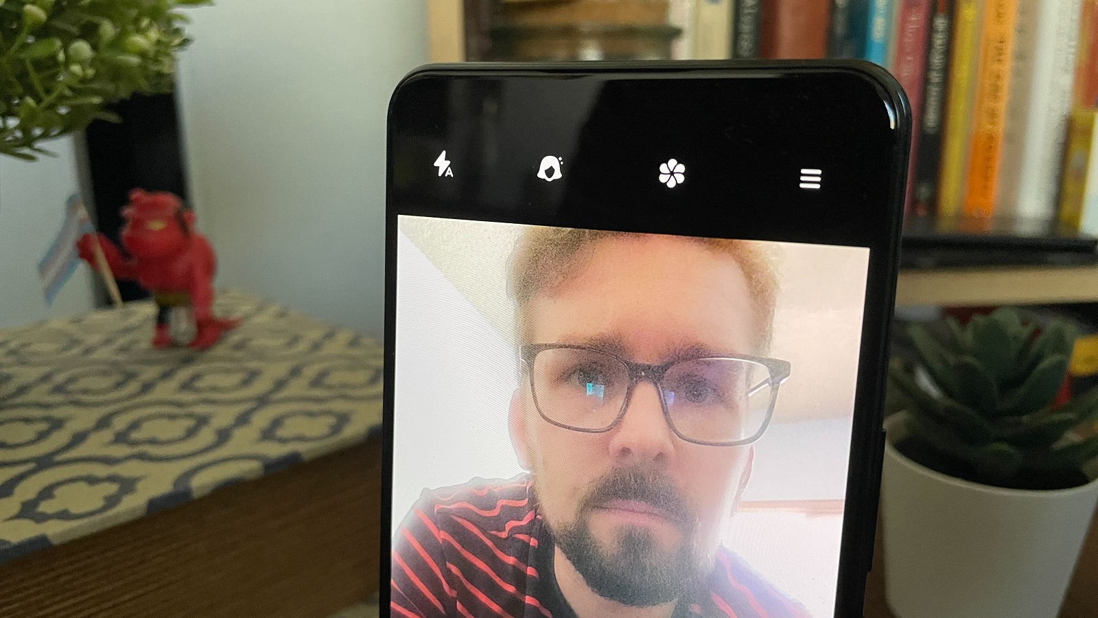
This isn’t a knock on the ZTE Axon 30, either – the under-display camera is pretty much invisible (you can barely see an off-color square above the camera if you angle the phone to catch outside light just right).
But that small patch of screen on the far left side just isn’t used or noticeable most of the time. In fact, I’d go so far as to argue that, like me, you probably wouldn’t notice if the notch or punch-hole was gone. Not just because we’ve trained ourselves to ignore these gaps in our phone media consumption, but because modern media just isn’t made with the extreme sides in mind.
Film class 101: keep the action in the middle
Next time you watch a movie or TV show, whether on your phone or a theater-size screen, see how often you’re paying attention to the leftmost and rightmost sides. If you’re humoring me, you’ll probably give it a strong few minutes before your attention is inadvertently drawn toward the center.
The center has everything worth watching – filmmaking convention keeps most of the subjects and action closer to the middle of the screen. This draws from theater tradition before it, giving patrons a good angle no matter where they’re seated, and the same is roughly true of movie theaters.
There are exceptions, of course, especially from filmmakers playing against convention by hiding elements in the corners of the frame, from William Friedkin’s The Exorcist (remember the demon face?) to Ari Aster’s Hereditary. But they’re exceptions proving a rule: keep action focused on the center. This has become convention enough that we’re now trained to pay attention to the middle of the screen, perpetuating a cycle of creation and consumption that most media doesn’t bother with the edges of the screen.
(The same is true of video games, too, but there’s something else to consider in smartphone gaming: if you’re playing with your device rotated sideways, your thumb is probably covering up that leftmost area where a notch or punch-hole would be.)
Convention – and waiting for consumers to buy newer phones
But there’s another convention at play, too: UX design. After half a decade of the notch, which was popularized by the Essential Phone and iPhone X in 2017 (and debuted on the Sharp Aquos S2 – thanks, Phone Arena), most of the area on the top of the display is relegated to mail and message notifications, battery life, phone signal, and other indicators.
Phone UX designers consider the notch in their designs, and cram all those icons in there instead of forcing more crucial interaction up top. It makes sense, but does mean that most interaction is designed to happen in the area below where any notch or punch-hole would be.
That’s for phone owners lucky enough to have notches and punch-holes – because many phone owners around the world don’t have them. While a little out of date, this mid-2020 Statista report claims that global market share of iPhones with notches (aka the iPhone X, iPhone XS, iPhone XR, and iPhone 11 models) is a little over 45%. That means over half the models in use are either older (the iPhone 8 and prior) or the iPhone SE models.
That’s just an example, and though it’s harder to track Android phones, it’s certain there are enough non-iOS phones without notches and punch-holes as well.
Don’t forget the ratios and resolution
But even with a phone packing an under-display camera and a full, unblemished screen, you still might not be able to watch your media from display edge to display edge – and it’s the same reason you’re still getting black bars around the edges of some media you watch on even the best TVs out there.
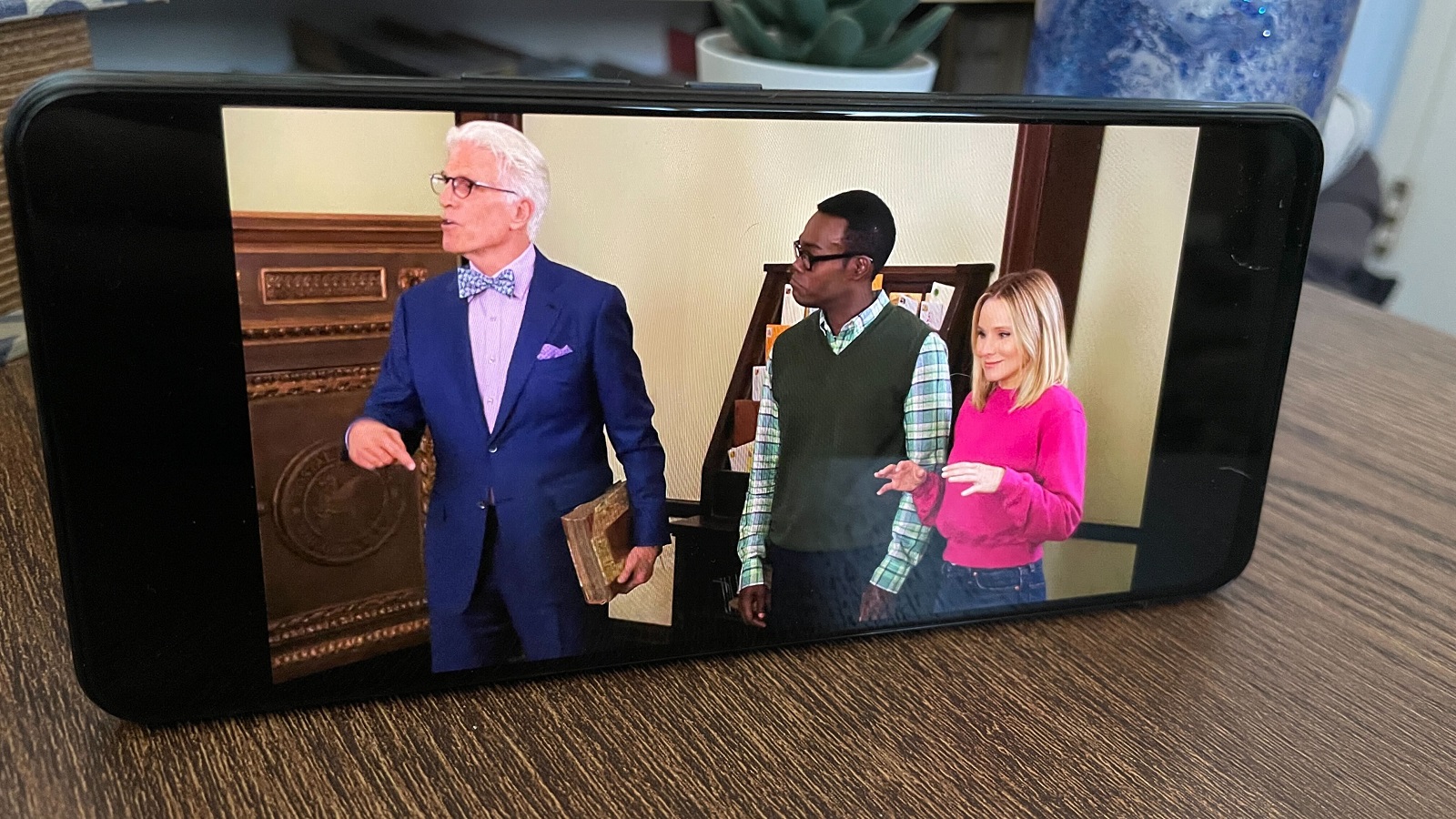
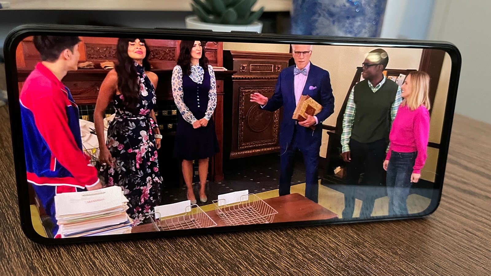
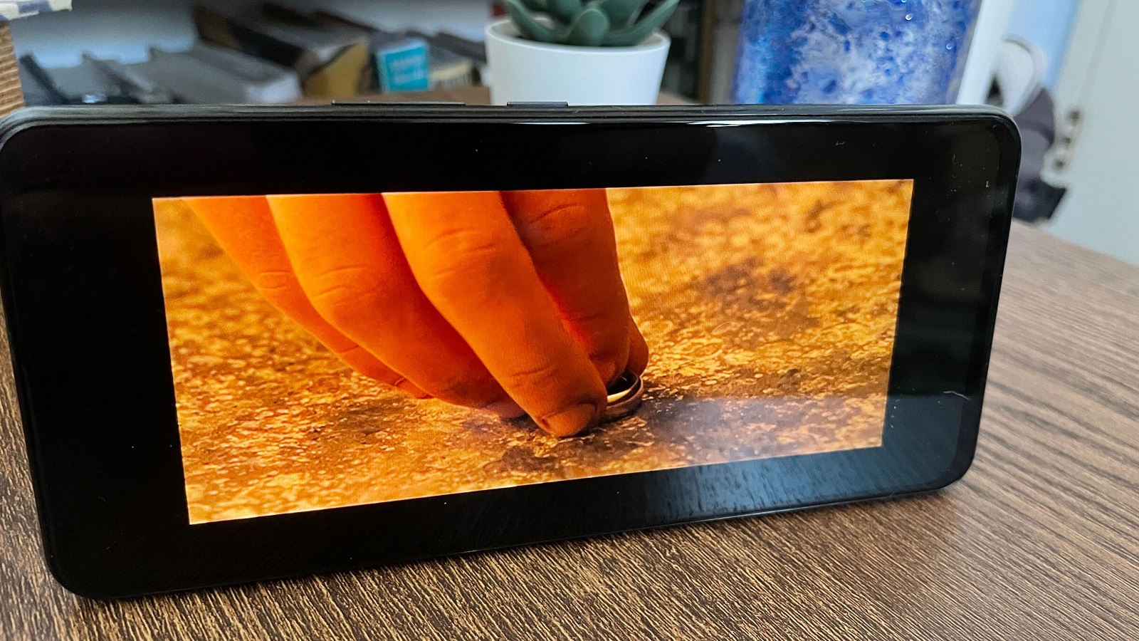
The reason I couldn’t watch media that filled the entire ZTE Axon 30’s display? Because those shows and movies weren’t shot in the 20.5:9 ratio to fit that phone’s screen. I fired up The Fellowship of the Ring on HBO and got giant vertical bars on either side, which made sense as it was shot in 2.35:1. Likewise, I fired up The Good Place (1.78:1) and saw the vertical bars.
Or you could think of it in terms of resolution: given the phone’s irregular Full HD Plus resolution (2460 x 1080) is larger than the typical Full HD resolution (1920 x 1080), those black bars are coming in to bookend a lot of media. Sure, you can expand the screen to fit the picture with some players (like YouTube and Netflix), but that cuts off some picture. No matter the reason, there’s a good chance that if you’re watching something, you probably aren’t seeing the extreme edges of the phone – so it doesn’t matter if you had a notch or not.
Overall, this isn’t something to worry about, as under-display cameras seem to be the next big development in phone design after other methods like pop-up selfie lenses have been abandoned.
- Check out everything we know about the iPhone 13
from TechRadar - All the latest technology news https://ift.tt/3BX552y
