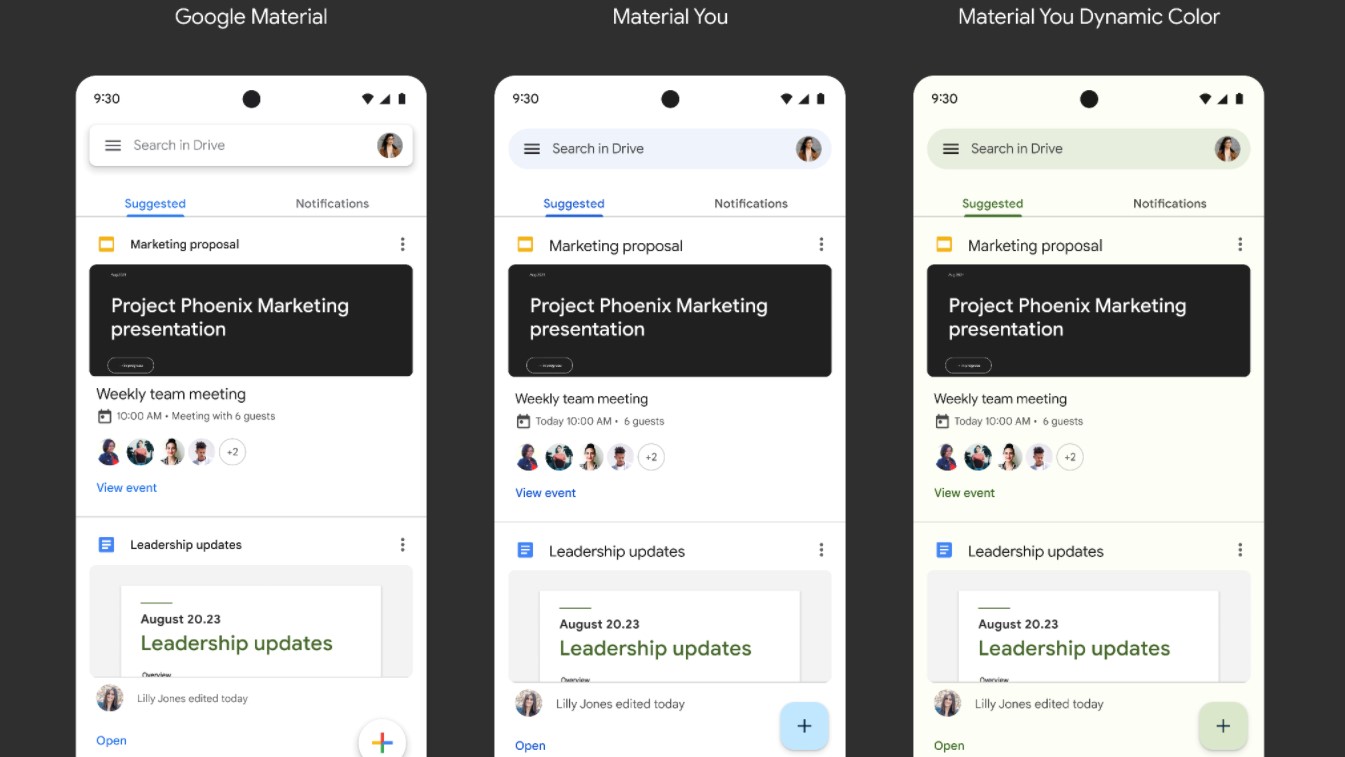
Ahead of the release of Android 12 Snow Cone in just a few weeks, Google has revealed that Google Workspace apps will also be getting a new Material You redesign.
For those unfamiliar, Material You is a new Material Design language for the latest version of the search giant's mobile operating system that is essentially a rethink of Android's whole user interface with rounded buttons, more varied colors as well as smoother motion and animations.
In a new post on the Google Workspace blog, Google announced that beginning today, a new Material You redesign will begin rolling out for Gmail, Meet, Drive, Docs, Sheets, Slides and Google Calendar for Workspace users.
- We've built a list of the best productivity tools available
- These are the best free office software solutions on the market
- Also check out our roundup of the best online collaboration software
Once the update arrives, users will notice that the company's online collaboration software now has updated navigation bars, improved floating action buttons and more Google Sans text for improved readability in smaller font sizes.

Material You Dynamic Colors
If you own a Google Pixel 5 or any other Pixel device running the latest version of Android, you'll also have the option to match the colors of your apps to your device wallpaper for a more dynamic, personalized look.
At the same time, to expand on Google's existing accessibility support, Material You will automatically adjust contrast, size and line width base on user preferences and app context. It's also worth noting that pre-existing color schemes such as color-coded file types, folder colors or in-app warnings will remain unchanged.
Based on the pictures in Google's blog post, the search button in Gmail will now feature rounded edges while the “Compose” button and icons at the bottom of the app will be getting a splash of blue. In Google Meet, the “New meeting” and “Join a meeting” buttons are now rounded while the bright blue icons for meetings have been replaced with a black calendar icon surrounded by a light blue circle. Google Drive is also getting a rounded search button while the editing menus in Slides, Docs and Sheets will now have a light green tint to them.
Being able to personalize your Android smartphone is one of the reason's many prefer Google's mobile operating system over Apple's iOS but it's also nice that Google is giving its Workspace apps the same Material You treatment.
- We've also rounded up the best project management software
from TechRadar - All the latest technology news https://ift.tt/2YMFZFl
